On this page
Mini Metro
My Background
I was
Gameplay mechanics
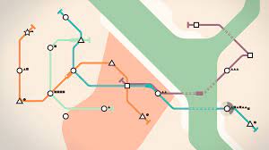
So, what do you do in the game? Basically the game loop is as follows:
- You use rail road lines to connect ever-appearing geometrically shaped stations, so that passengers could ride the train to the station of their shape.
- Every in-game week you choose which upgrades to receive,
- And try to avoid passengers overcrowding your stations, which will be a game over. Simple.
Fewer game elements you have – easier to learn their basics
Fewer game elements, also allow you to pay more attention to polishing their Mechanics.
- Some stations are rare, but popular - you have to plan an easy access to them
- Should you spend a tunnel to go under the river, or make a rail line go around the water, but make path longer?
- Sharp turns at the stations make trains stop at them even if station is empty, so you should avoid that
Difficulty spikes up fast after initial weeks and you start revising your strategy before angry city government closes up your underground.
Structure, Variety, Progression
To talk about risks of minimalist approach I need to tell you about the Level variety
Level variety
So, each level in Mini Metro is a different city.
And their variety is achieved by manipulations with...
What’s even cooler:
- They’ve been adding lots of levels after release,
- and Steam version allows to play levels created by community!
Risks of minimalism
After unlocking every level I started completing hard challenges. I felt awesome when I did the 1st three levels, but then I've started noticing the repetition in challenge rules and pretty quickly lost interest in completing them.
So it means that for me at that point the game has lost the sense of novelty
Possible solutions I would suggest - adding more character to the cities by:
- Adding some cultural accurate icons;
- Adding challenges more in line with the cities;
- Maybe, adding small unlockable facts about their transit systems I know it means more research work, but I feel that it might be just as rewarding
Aesthetics: Elegant
The game is a love letter to graphic design. It feels like an ode to legacies of Harry Beck's London Tube map and Massimo Vignelli’s New York City Subway map.
Sound design was codeveloped with Disasterpeace.
The procedurally generated sound FX form the abstract music that feels chill while you’re doing okay, but unnerving when peeps (passengers) start to overcrowd.
Overall, I would say that even if the game didn’t have all the texts and translations, the graphic design, animation and player’s real life experiences with the signage would do keep it accessible.
Spare thoughts
Mini Metro is very accessible!
- You can play it almost anywhere!
- Game supports lots of languages, even RTL (Right-To-Left)!
- As the game has mostly touch/mouse controls, it is not that accessible for fully blind people (can’t be truly sure about a console version, as it uses focus/D-pad system, but I couldn’t acces it).
- But accessible almost to everyone else:
- Colourblind mode help people with colourblindness
- Animations and UI are efficient and juicy enough for people with hearing problems.
- The game has an option to disable those awesome, but a bit nauseating menu transitions and to disable vibration.
UX: Quick to Boot
The UI/UX of the game is top notch too:
- You can stop in-game time to decide your next move, or you can speed it up, if you are sure with your decisions.
- The simple graphics make game fast to boot.
- The game pauses the time, when you violate rules of the challenge to help you undo the wrong action.
- Launch the game and you will continue right where you were
The last point are also why I find it's mobile version as a good example of plug'n'play kind of a game.
I found myself playing Mini Metro while waiting for lunch, for friend or even while riding the subway! Meta!
Developer's Vision
Inspired by their experiences at navigating the London metro map developers from Dinosaur Polo Club jammed and created the game about managing the rail transit networks.
And in the process they’ve mastered the Minimalist approach to game design.

Conclusion
Mini Metro is a champion of minimalism:
- Its gameplay is easy to learn, but hard to master
- Its aesthetics are iconic (hehe!) and efficient
- UX helpful and just enough
But for me personally it haven’t escaped the main problem of minimalist approach: The lack of novelty over time.
It’s just my opinion!
Still the game is awesome and I recommend it for everyone who loves trains, game design, strategy, graphic design and trains!
Additional links
Watch
- Mini Metro: When Less is More - Talk about visual design of Mini Metro
- GCAP 2016: End of the Line: The Geometry of Mini Metro - Peter Curry - A very technical talk about engine and rendering
- Mini Metro - A Musical Subway (System) - Talk about sound systems
- Serialism & Sonification in Mini Metro (GDC 2018) - Talk about sound in Mini Metro
Read
YBdesigning is a personal blog and guide into game design by Yelnar Bolatov, classical web & app UI/UX designer
Social
Bluesky
YouTube
Patreon
More
References
Top patrons
Changelog
About project

Mechanics overview
Camera
World
Time
Movement
Combat
Interact with objects
Play a Role
Management
Relax - Watch Cinematics
Relax - Vibe Check
Foundations overview
Vision
Genre
Accessibility
Difficulty
Adaptive design
Game Size
Game Feel
Aesthetics overview
Theme
Mood
Game feel
Physics
Visual style
Sound
User Interface
UI overview
Typography
Colors
Structure overview
Progression for
Story
Levels
Skill
Abilities, resources
Progression order
Linear
Open World
Branching
Home
Get Started
Foundations
Mechanics
Structure
Aesthetics
Cases
Blog

My Background
I was
Gameplay mechanics
So, what do you do in the game? Basically the game loop is as follows:
- You use rail road lines to connect ever-appearing geometrically shaped stations, so that passengers could ride the train to the station of their shape.
- Every in-game week you choose which upgrades to receive,
- And try to avoid passengers overcrowding your stations, which will be a game over. Simple.
Fewer game elements you have – easier to learn their basics
Fewer game elements, also allow you to pay more attention to polishing their Mechanics.
- Some stations are rare, but popular - you have to plan an easy access to them
- Should you spend a tunnel to go under the river, or make a rail line go around the water, but make path longer?
- Sharp turns at the stations make trains stop at them even if station is empty, so you should avoid that
Difficulty spikes up fast after initial weeks and you start revising your strategy before angry city government closes up your underground.
Structure, Variety, Progression
To talk about risks of minimalist approach I need to tell you about the Level variety
Level variety
So, each level in Mini Metro is a different city.
And their variety is achieved by manipulations with...
What’s even cooler:
- They’ve been adding lots of levels after release,
- and Steam version allows to play levels created by community!
Risks of minimalism
After unlocking every level I started completing hard challenges. I felt awesome when I did the 1st three levels, but then I've started noticing the repetition in challenge rules and pretty quickly lost interest in completing them.
So it means that for me at that point the game has lost the sense of novelty
Possible solutions I would suggest - adding more character to the cities by:
- Adding some cultural accurate icons;
- Adding challenges more in line with the cities;
- Maybe, adding small unlockable facts about their transit systems I know it means more research work, but I feel that it might be just as rewarding
Aesthetics: Elegant
The game is a love letter to graphic design. It feels like an ode to legacies of Harry Beck's London Tube map and Massimo Vignelli’s New York City Subway map.
Sound design was codeveloped with Disasterpeace.
The procedurally generated sound FX form the abstract music that feels chill while you’re doing okay, but unnerving when peeps (passengers) start to overcrowd.
Overall, I would say that even if the game didn’t have all the texts and translations, the graphic design, animation and player’s real life experiences with the signage would do keep it accessible.
Spare thoughts
Mini Metro is very accessible!
- You can play it almost anywhere!
- Game supports lots of languages, even RTL (Right-To-Left)!
- As the game has mostly touch/mouse controls, it is not that accessible for fully blind people (can’t be truly sure about a console version, as it uses focus/D-pad system, but I couldn’t acces it).
- But accessible almost to everyone else:
- Colourblind mode help people with colourblindness
- Animations and UI are efficient and juicy enough for people with hearing problems.
- The game has an option to disable those awesome, but a bit nauseating menu transitions and to disable vibration.
UX: Quick to Boot
The UI/UX of the game is top notch too:
- You can stop in-game time to decide your next move, or you can speed it up, if you are sure with your decisions.
- The simple graphics make game fast to boot.
- The game pauses the time, when you violate rules of the challenge to help you undo the wrong action.
- Launch the game and you will continue right where you were
The last point are also why I find it's mobile version as a good example of plug'n'play kind of a game.
I found myself playing Mini Metro while waiting for lunch, for friend or even while riding the subway! Meta!
Developer's Vision
Inspired by their experiences at navigating the London metro map developers from Dinosaur Polo Club jammed and created the game about managing the rail transit networks.
And in the process they’ve mastered the Minimalist approach to game design.

Conclusion
Mini Metro is a champion of minimalism:
- Its gameplay is easy to learn, but hard to master
- Its aesthetics are iconic (hehe!) and efficient
- UX helpful and just enough
But for me personally it haven’t escaped the main problem of minimalist approach: The lack of novelty over time.
It’s just my opinion!
Still the game is awesome and I recommend it for everyone who loves trains, game design, strategy, graphic design and trains!
Additional links
Watch
- Mini Metro: When Less is More - Talk about visual design of Mini Metro
- GCAP 2016: End of the Line: The Geometry of Mini Metro - Peter Curry - A very technical talk about engine and rendering
- Mini Metro - A Musical Subway (System) - Talk about sound systems
- Serialism & Sonification in Mini Metro (GDC 2018) - Talk about sound in Mini Metro
Read
On this page
Mini Metro
YBdesigning is a personal blog and guide into game design by Yelnar Bolatov, classical web & app UI/UX designer
Social
Bluesky
YouTube
Patreon
More
References
Top patrons
Changelog
About project